Seen but not clicked – lowering rankings to improve search
Have you looked at your web analytics report and wondered what your users really want?

The simple answer is they are already telling you, however services like Google, Bing and Baidu store this information. Observatory analysis of .gov.au shows around 75% of our users are coming from search engines. A unique aspect of search is that people use plain English to find the services that meet their needs. You can use this information to understand what your users are trying to do. Luckily, these search engines offer these insights for free through their webmaster tools.
What are webmaster tools?
Webmaster tools are free services provided by most search engines. They are a rich source of data on how websites perform and how users access them.
Their reports provide:
- search queries used to get to a specific page
- the page’s position on the search results
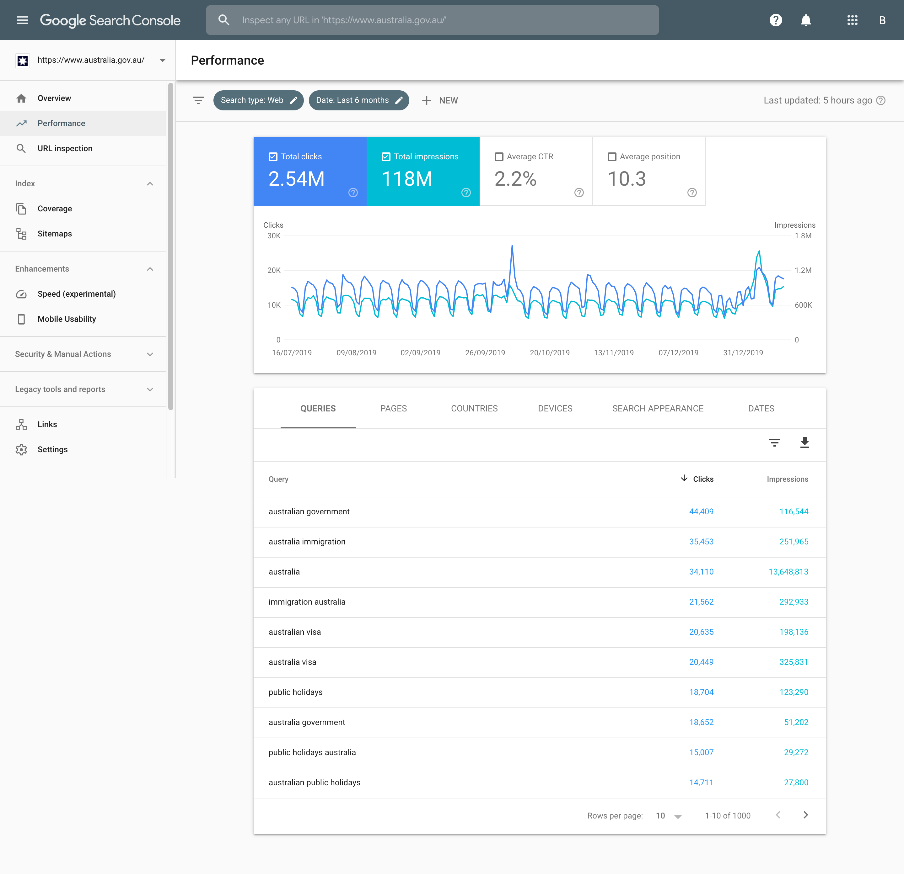
- the number of impressions — how many people viewed the result
- the click-through rate — the percentage of users who clicked though from an impression

Caption: The Performance report shows the top 4 queries for Australia.gov.au in the last 6 months.
Why use them?
These services capture your users’ intent through the questions that they ask. It is a passive data collection technique and you and your users do not need to do anything more. It is also cheaper than other participatory user research methods.
However, it compliments other forms of user research rather than replacing them. You can create a holistic view of your service by combining these quantitative and qualitative methods.
How we use webmaster tools
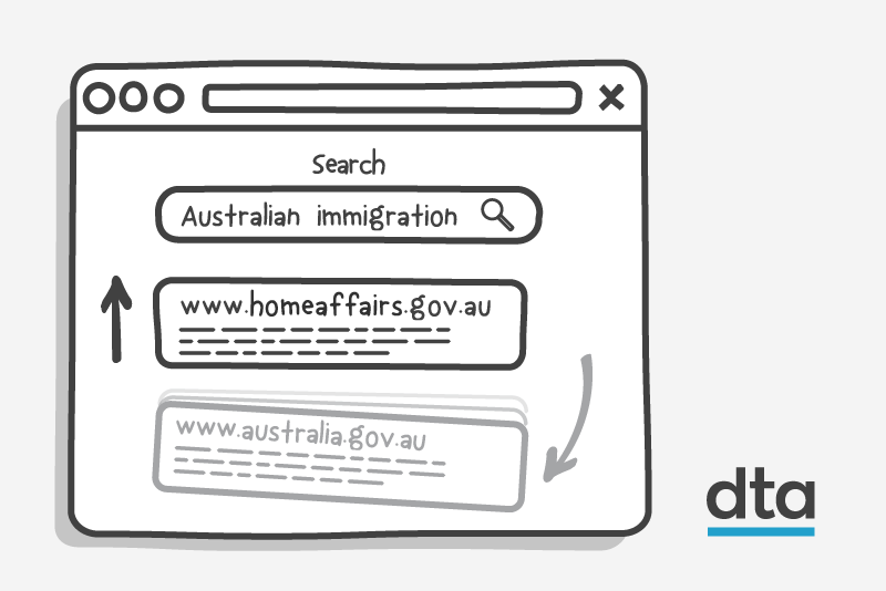
Our hypothesis was that a significant number of users were coming to Australia.gov.au looking for visa information. They were then leaving to find that information at homeaffairs.gov.au. Australia.gov.au was an unnecessary step in their user journey.
We used the connection between Google’s BigQuery and Search Console and our whole-of-government Google Analytics 360 contract to find out why.
- We identified the common immigration-related search terms people used to arrive at Australia.gov.au.
- We noted the pages people visited after using these search terms.
- We identified where our users were flowing from those pages.
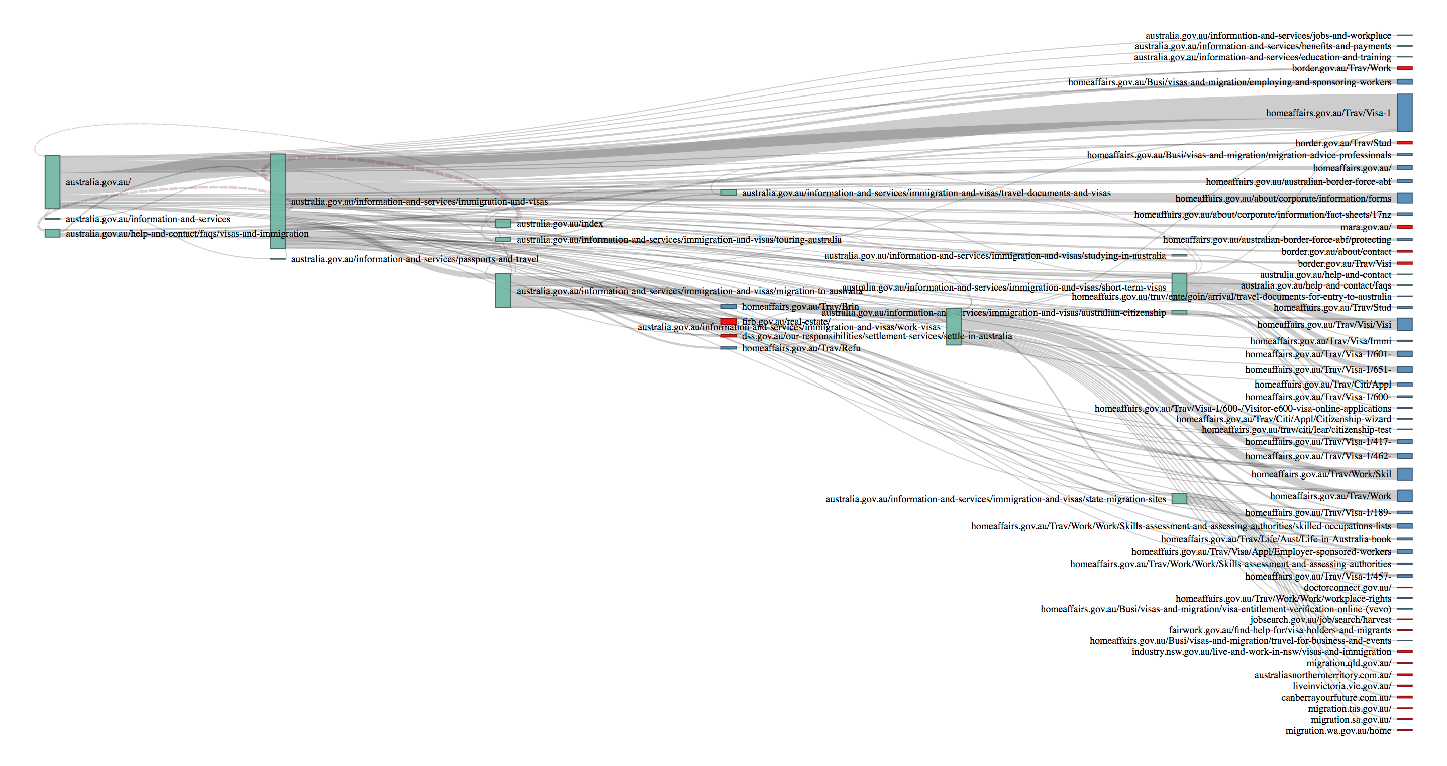
- We visualised this through a Sankey diagram.
This diagram showed how users flowed through Australia.gov.au to their final destination.

Caption: This diagram shows the flow of traffic from left to right, starting at Australia.gov.au, moving through deeper content, or nodes, and finally various endpoints. Green nodes are Australia.gov.au webpages, blue nodes are homeaffairs.gov.au webpages and red nodes are other pages. Select it to see a larger version.
Our results
The experiment showed that our hypothesis was correct. Search algorithms tend to favour established brands, so search engines consider results from Australia.gov.au more reliable than results from more specific agency .gov.au websites. Users looked for general visa information on Australia.gov.au, and then moved quickly to Home Affairs websites. This suggests that Australia.gov.au is an unnecessary step in this user journey.
Our response was to do the opposite of what most sites do. We reversed our search engine optimisation to lower the ranking of Australia.gov.au. This allows other .gov.au websites with more current and accurate content to appear higher in search results, giving them a greater chance of being selected. It took about 3 months for the Google search algorithms to recognise the change and noticeably affect search results.
We also noticed that:
- many users went to Home Affairs’ general visa page, but others were looking for specific visa and immigration information
- people also looked for migration information on state and territory sites
- some users were looking for investment information, such as the Foreign Investment Review board’s information on buying real estate.
Our analysis showed users searched for very sparse phrases, such as “Australia Visa” or “Australia Immigration”. This makes it challenging for search algorithms to show the best search results. Agencies can take various approaches to solve this problem, but they need to invest in search engine optimisation and analyse their own data before deciding.
Other agencies can apply the methodology we used to other user research or policy evaluation problems. We’ve published a guide on optimising search engine results. We also have a web analytics guide, currently in Beta, to help product and service owners incorporate analytics into their agile lifecycle.
About the Observatory
The Observatory already has 32 partner agencies covering 1.167 billion interactions each month, and over 14 billion data points in the past year. We run free Google Analytics 360 training for agencies to help them get the most out of the whole-of-government Google Analytics 360 subscription. If you run a government service and want to know how the Observatory can help you improve it, email us at observatory@dta.gov.au.